| Home · All Classes · Modules |
The QPushButton widget provides a command button. More...
Inherits QAbstractButton.
Inherited by QCommandLinkButton.
The QPushButton widget provides a command button.
The push button, or command button, is perhaps the most commonly used widget in any graphical user interface. Push (click) a button to command the computer to perform some action, or to answer a question. Typical buttons are OK, Apply, Cancel, Close, Yes, No and Help.
A command button is rectangular and typically displays a text label describing its action. A shortcut key can be specified by preceding the preferred character with an ampersand in the text. For example:
QPushButton *button = new QPushButton("&Download", this);
In this example the shortcut is Alt+D. See the QShortcut documentation for details (to display an actual ampersand, use '&&').
Push buttons display a textual label, and optionally a small icon. These can be set using the constructors and changed later using setText() and setIcon(). If the button is disabled the appearance of the text and icon will be manipulated with respect to the GUI style to make the button look "disabled".
A push button emits the signal clicked() when it is activated by the mouse, the Spacebar or by a keyboard shortcut. Connect to this signal to perform the button's action. Push buttons also provide less commonly used signals, for example, pressed() and released().
Command buttons in dialogs are by default auto-default buttons, i.e. they become the default push button automatically when they receive the keyboard input focus. A default button is a push button that is activated when the user presses the Enter or Return key in a dialog. You can change this with setAutoDefault(). Note that auto-default buttons reserve a little extra space which is necessary to draw a default-button indicator. If you do not want this space around your buttons, call setAutoDefault(false).
Being so central, the button widget has grown to accommodate a great many variations in the past decade. The Microsoft style guide now shows about ten different states of Windows push buttons and the text implies that there are dozens more when all the combinations of features are taken into consideration.
The most important modes or states are:
As a general rule, use a push button when the application or dialog window performs an action when the user clicks on it (such as Apply, Cancel, Close and Help) and when the widget is supposed to have a wide, rectangular shape with a text label. Small, typically square buttons that change the state of the window rather than performing an action (such as the buttons in the top-right corner of the QFileDialog) are not command buttons, but tool buttons. Qt provides a special class (QToolButton) for these buttons.
If you need toggle behavior (see setCheckable()) or a button that auto-repeats the activation signal when being pushed down like the arrows in a scroll bar (see setAutoRepeat()), a command button is probably not what you want. When in doubt, use a tool button.
A variation of a command button is a menu button. These provide not just one command, but several, since when they are clicked they pop up a menu of options. Use the method setMenu() to associate a popup menu with a push button.
Other classes of buttons are option buttons (see QRadioButton) and check boxes (see QCheckBox).
 |
A push button shown in the Macintosh widget style.
Note that when a button's width becomes smaller than 50 or its height becomes smaller than 30, the button's corners are changed from round to square. Use the setMinimumSize() function to prevent this behavior. |
 |
A push button shown in the Windows XP widget style. |
 |
A push button shown in the Plastique widget style. |
In Qt, the QAbstractButton base class provides most of the modes and other API, and QPushButton provides GUI logic. See QAbstractButton for more information about the API.
The parent argument, if not None, causes self to be owned by Qt instead of PyQt.
Constructs a push button with no text and a parent.
The parent argument, if not None, causes self to be owned by Qt instead of PyQt.
Constructs a push button with the parent parent and the text text.
The parent argument, if not None, causes self to be owned by Qt instead of PyQt.
Constructs a push button with an icon and a text, and a parent.
Note that you can also pass a QPixmap object as an icon (thanks to the implicit type conversion provided by C++).
Reimplemented from QObject.event().
Reimplemented from QWidget.focusInEvent().
Reimplemented from QWidget.focusOutEvent().
Reimplemented from QAbstractButton.hitButton().
Initialize option with the values from this QPushButton. This method is useful for subclasses when they need a QStyleOptionButton, but don't want to fill in all the information themselves.
See also QStyleOption.initFrom().
Reimplemented from QWidget.keyPressEvent().
Returns the button's associated popup menu or 0 if no popup menu has been set.
See also setMenu().
Reimplemented from QWidget.minimumSizeHint().
Reimplemented from QWidget.paintEvent().
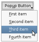
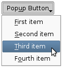
Associates the popup menu menu with this push button. This turns the button into a menu button, which in some styles will produce a small triangle to the right of the button's text.
Ownership of the menu is not transferred to the push button.
 |
 |
Push buttons with popup menus shown in the Plastique widget style (left) and Cleanlooks widget style (right). |
See also menu().
This method is also a Qt slot with the C++ signature void showMenu().
Shows (pops up) the associated popup menu. If there is no such menu, this function does nothing. This function does not return until the popup menu has been closed by the user.
Reimplemented from QWidget.sizeHint().
| PyQt 4.10.1 for MacOS | Copyright © Riverbank Computing Ltd and Nokia 2012 | Qt 4.8.4 |